
What Austin Designers Really Think About Pantone’s 2026 Color of the Year
We asked local interior design pros to weigh in on the controversial color choice
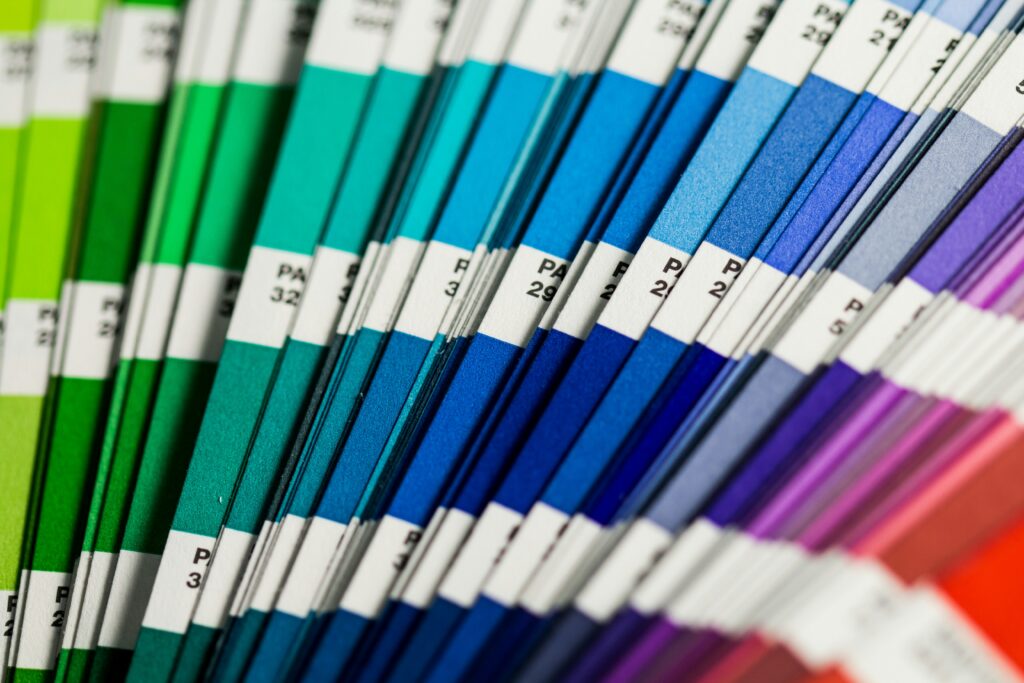
Pantone — a company that over 10 million creatives turn to for color-conscious decisions—has just announced its highly anticipated 2026 Color of the Year: “Cloud Dancer,” which quickly sparked conversations across industries. Each year, the announcement ripples through a variety of trades ranging from fashion and interiors to branding and product design. Now a cultural fixture, Pantone’s annual pick often reflects the mood of the moment and shapes what comes next.
Pantone selects its Color of the Year after an extensive, year-long global trend analysis by its Color Institute experts. These experts track big-picture cultural shifts to pinpoint a hue that captures the global mood rather than a fleeting trend. The process involves continuous research and meetings where professionals gather to decide the precise hue and a name that best encapsulates the collective aspirations and feelings of the world for the upcoming year.
A color choice that sparked conversation
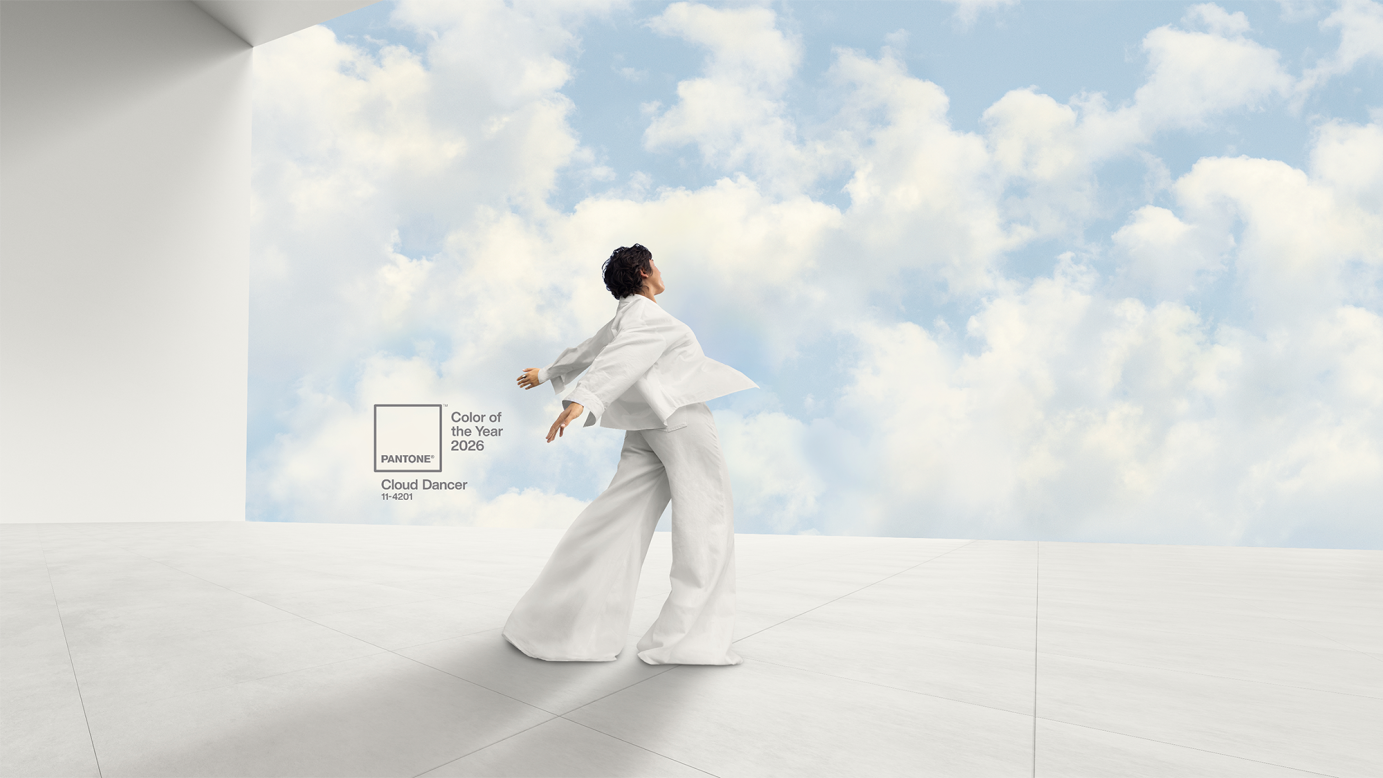
Pantone describes Cloud Dancer as “a lofty white that serves as a symbol of calming influence in a society rediscovering the value of quiet reflection.” So we asked some of Austin’s top designers for their take on this year’s selection, and the reactions weren’t exactly enthusiastic.
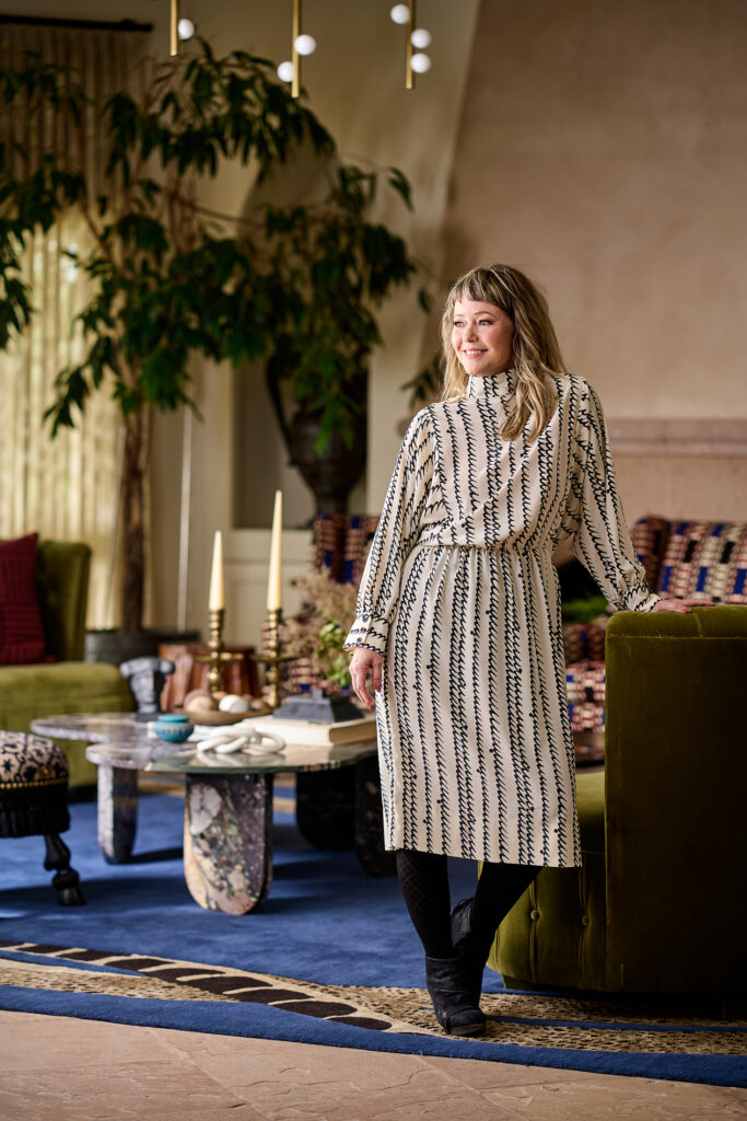
Sarah Stacey of Sarah Stacey Interior Design shared that white tends to make her feel anxious and described the choice as “lazy,” arguing that a splash of color would be more joyous. Hannah Griffiths of Studio Palindrome echoed this sentiment, saying the selection of “a near achromatic white feels more like cultural or political commentary rather than a trend forecast,” and further agreed with Stacey, adding, “I would’ve loved to see something bolder and more vivid.” Stephanie Brown of Saint Louise Design summed up the overarching disappointment, saying, “It’s an unexciting pick that misses the energy and warmth driving design right now.”
Brown argued that though Pantone frames this color as a source of peace and renewal, it “can just as easily read as surrender; a symbolic ‘white flag.’ And at this moment, leaning into whitewashing as a concept feels culturally tone-deaf.”
To these local professionals, the pick feels sterile and unimaginative.
So what should 2026 look like?
When asked what they’d choose instead, the designers were unanimous: color and warmth.
Griffiths and Stacey shared a similar point of view. Griffiths said her pick would’ve been “a fluorescent chartreuse (signaling) experimentation and optimism,” adding that “color should inspire and push us forward, not fade into the background.” Stacey also chose chartreuse as her company’s preferred shade “because it’s always unexpected,” explaining that “even the smallest touch of it brings everything to life in a way you don’t see coming.”
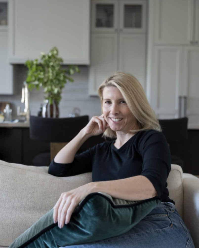
And while the others leaned toward chartreuse, Brown offered a different direction. “Something sunbaked, grounding, and emotionally warm would have felt much more timely. Even a deep auburn could have captured the richness and sense of renewal we’re seeing. Those hues feel connected to nature, craft, and comfort in a way that aligns with how people actually want to live right now,” she said.
All three designers were left wanting more, saying Cloud Dancer will have little impact on their current work. Stacey emphasized that her company rarely incorporates white. Brown sees her clients turning “toward enveloping warmth rather than starkness.” And Griffiths summed it up simply: “the world already has an endless supply of whites to specify.”
The creative world will continue to evolve, and Pantone will continue to predict. But is this shade of white truly the tone-setter for 2026? And does it signal a year defined by restraint rather than expression? Not if these Austin designers have anything to say about it.